Columbus, Ohio

So I’ve been ignoring badflags for a long time,  and a bunch of people have been telling me how lame that is, so after another hiatus, I’m back with something special. I live in Columbus, Ohio, and I really love this city. I love it so much that it’s a little hard to tell Columbus that its flag is terrible. But it really is. Not the worst I’ve seen, and not even in the bottom quintile of flags, but it’s just plain ugly. So with the inevitable takedown, I’ve offered a suggestion for a new, much better flag.

The current flag of Columbus is not quite a travesty, but it’s pretty bad. It’s a fairly boring tricolor with a ton of crap in the middle. The Santa Maria in in there, inside an American shield, a semi circle of some plants and a semi circle of stars surround an eagle holding the American flag on supporting what looks like the rotunda of the Statehouse. That’s a lot of stuff that doesn’t really mean anything!

This actually brings up an interesting point: The American flag is idenitfible within the Columbus flag. There’s no way the Columbus flag would be identifiable within some other flag. (Perhaps Beechwold has its own flag and includes the Columbus flag inside of it, with the American flag inside the Columbus flag.) That’s not good.

“Columbus, Ohio,” is spelled out in a gothic font, no doubt a nod to the German heritage of some Columbusites. I always think writing on flags is a bad idea. Flags should be understood through symbols, they shouldn’t need explanation. But if a flag has to have writing, I think a sans serif font is best of legibility from a distance.

Here’s my design for a new Columbus flag.
Columbus

A tricolor is a very traditional basis for a flag. Using non-primary colors pulls this design out of the 18th century and into the modern era while still retaining a classic background, just in the way that Columbus is modern city built on the traditions of the past.

The grey field represents techonology. The blue field represents our bountiful water resources. The green field represents the verdant patches of our city, our agricultural heritage and our commitment to the green movement.

I struggled for a while about what to put at the center of the flag – Columbus doesn’t have a single defining icon. To me, Columbus is a city in which the good life is accesible to a lot of people. Our cost of living is low. Our quality of life is high. There are still opportunties for people who work hard, and people can create their own opportunities as well. Nothing speaks to the idea of a sweet life and affordable luxuries better than ice cream. And we happen to be a mecca of great ice cream, to boot. And ice cream is never going out of style. Ever. This flag is unique and identifiable.  And also, the triangle is the strongest shape. So there you go.

Greene County, Virginia

Yes, another Greene County, another bad flag. If I had to pick, though, I”d say this one is about three times as bad as Greene County, Ohio. I get the green part. It’s the County of Greene – see what they did there?  The rest of the flag is a bit of a puzzle. Spotswood? Golden Horseshoe? 1717 and 1838? The only thing I can think of is that county officials designed this flag on the back of a cocktail napkin after a long night of slugging bourbon at the Blue Ridge Cafe in Ruckersville. The county board of supervisors were particularly wasted, and could barely open their eyes, let alone form words when they started mumbling partially hallucinated random numbers and words. How else could you come up with “Spotswood,” and “Golden Horseshoe,” (and not even make the horseshoe on the flag gold?) Thank God the county’s graphic designer left off the suggestion of “Mouse Tits,” from at-large Administrator Carl Schmitt. Too embarassed to admit their overindulgence the next day, the board of supervisors unanimously voted to approve the flag.

Poperinge, Belgium

Poperinge, Belgium

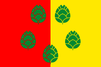
Oh, yeah – Don’t worry about it! Just put artichokes whereever you want! Put them right on my fields of red and gold! Yeah!

Kvalsund, Noway

Kvalsund, Norway

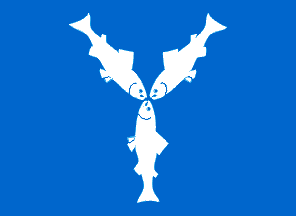
Y, indeed.

Seoul, South Korea

Seoul, South Korea

I have to give South Korea credit. It has subnational flags. (Suck it China – such a big nation, and only that one red and yellow flag to make fun of. What a waste.) In general, though, South Korea’s flags are super lame. Judging by the stark white, teal, pink and blue color palate, this flag is so totally from the ’80s. There must have been a flag designing contest right before the Seoul Summer Olympics in 1988 (the ones when people freaked out when Greg Louganis got AIDS blood in the pool, the East German women cleaned up in swimming and Ben Johnson embarassed Canada yet again with his steriods disqualification) so South Korea could show its pride.

The symbolism is pretty perplexing. I think the pink ball and blue shape represent Seoul’s favorite passtime: Jai Alai! (There is a large Basque immigrant population in the Apkujong neighborhood.) The teal blob represents a deformed hand. The Koreans are very inclusive and accommodating to their disabled countrymen.

Yaroslavl Oblast, Russia

Yaroslavl Oblast, Russia

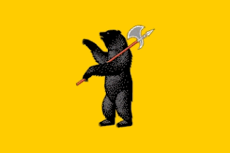
Oh my God oh my God oh my God… The bears have learned to use weapons. It’s only a matter of time until Ursa Major here puts down that halberd and picks up an AK47 with her newly opposable-thumbed paws. The bear is also fully bipedal. Humans, bow before your new ursine overlords.

Oh, but it looks like she’s waving “Hi.” Maybe we should go over and see if she’s a friendly bear. You know, most bears are more afraid of us than we are of them.

The Horror! The Agony! She has sliced open my abdominal cavity and is feasting on my pancreas!!!! Get help quickly. Don’t let my death be in vain. Life is escaping me, but promise me. Promise me you will find the bear’s young and do to them what she has done to me…  ..    .

Greene County, Ohio

Greene County, Ohio
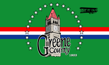
GODDAMMIT, ORVILLE – WATCH OUT FOR THAT CLOCK TOWER!!!!!

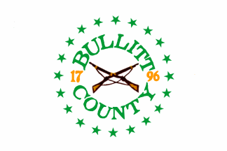
Bullitt County, Kentucky

Bullit Co. Kentucky

Let’s just say it: the crossed muskets front and center really make me think the name of this county is Bullet, but the flag designer misspelled it because he or she is from Kentucky.  It’s not very nice of me to revert to a yokel stereotype, but I’m sure 90% of readers would agree. First impressions are a bitch.

Once we get past that, the symbolism is kinda janky. The white background represents salt, which was an important natural resource in Bullitt County 200 years ago. The green in the text represents the fertile land and prolific game from 200 years ago. The muskets represent the fact that 200 years ago, people shot other people a bunch to get their land. The 20 stars refer to Bullitt being the 20th county in Kentucky (in 1796, naturally.)

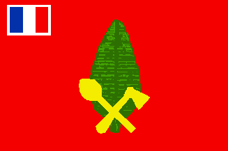
Alo Island, Wallis and Futuna

Alo Island, Wallis and Fortuna

What’s the first that comes to mind when you think of idyllic islands in the South Pacific? Axes and clubs, right? Me too. And so do the Alo Islanders. This is the only flag I have seen that commemorates a murder – that of Father Chanel, who came in 1837 as a Catholic missionary, only to be savagely clubbed and axed to death in 1841. Probably somewhere near a large palm frond. This flag is a reminder to stay the hell away from Alo, especially if you’re a priest. (*Closed captioning brought to you by France.)

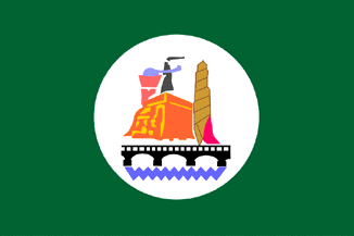
Bani Suwayf, Egypt

eg-bani

The only symbols I can verifiably identify here are the zigzaggy river and the arched bridge. After that, it gets pretty fuzzy.

I think the orange and yellow blob is the Bent Pyramid of Sneferu. Which was a total let down, by the way – the slaves got half way up, had to change course a little, and then had to start over from scratch. (Twice actaully, as Sneferu’s Red Pyramid was also a bust.) It’s a good thing he ruled for 29 years, or his mummy might have been stowed away in this subpar architectural blunder. But Egyptian engineering really picked up steam quickly, due to Sneferu’s building spree. His son Khufu commissioned the Great Pyramid of Giza, which makes Sneferu’s Bent Pyramid look super lame in comparison.

After that, it gets really tricky. There are three tower-like objects. Two are ethereal, not anchored to the ground, and are spewing some sort of pollution. Maybe one of these is the Olympic torch?  The other, I think is the world’s largest croquembouche, with a pink entrance, that you can climb up into to view the Bent Pyramid. I can’t triangulate my sources on this one, though.